Context
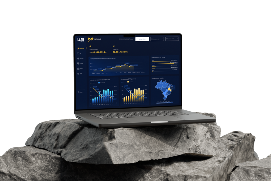
Betnacional needed a clear, strategic way to monitor the performance of its media investments. The team struggled to view fragmented data from multiple platforms, including Google Ads and Meta, and turn that information into actionable decisions.
The challenge was to create a centralized interface that presented the data objectively and by segment, enabling analysts to compare results, identify patterns, and improve campaign ROI.
User
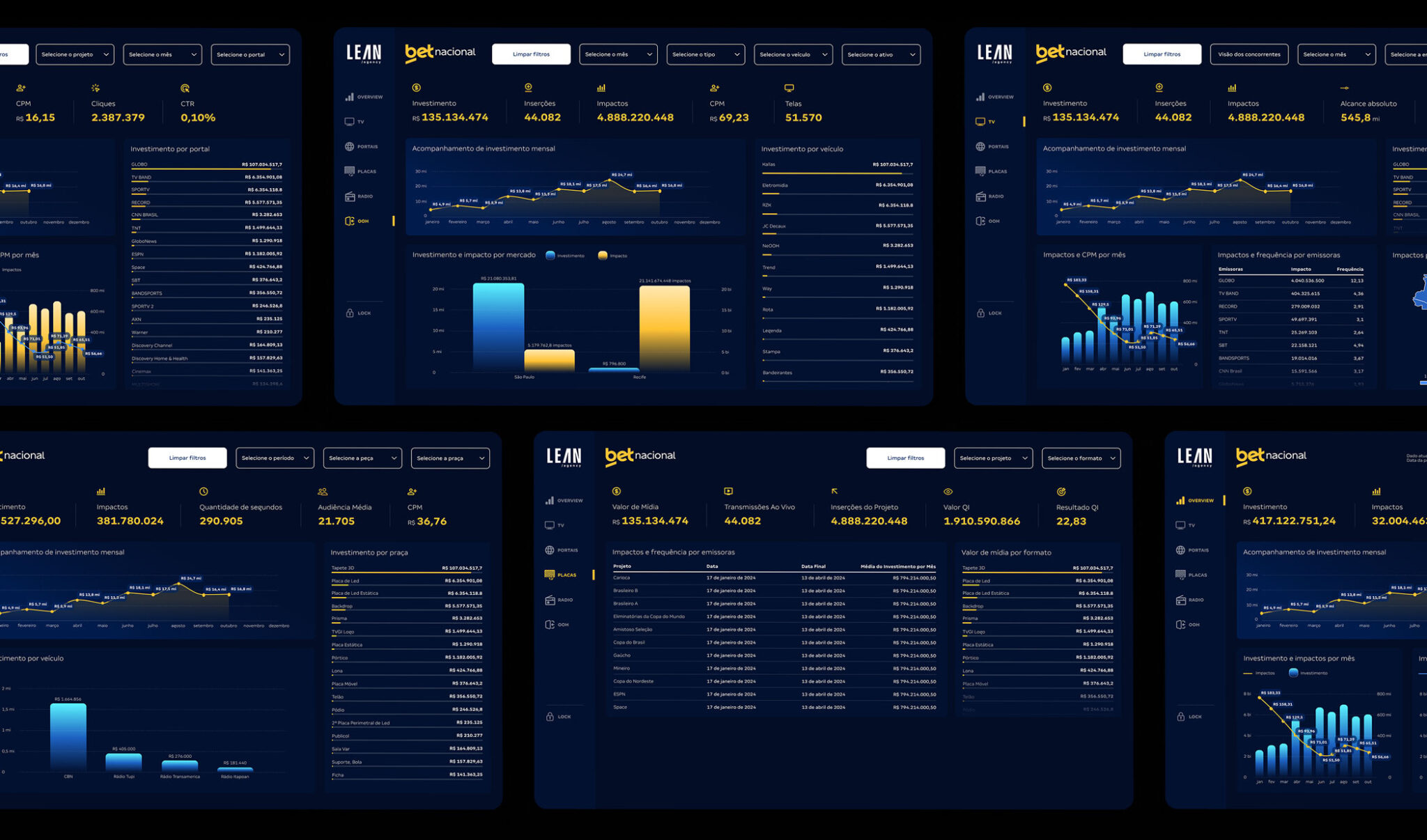
“As a Betnacional media analyst, I want to view investments and returns by platform and compare current and historical data so that I can optimize my strategies and achieve better results.”
This statement guided our design decisions, keeping the focus on what truly affects the end user’s workflow and goals.
Design Process
User Research and Interviews
We interviewed analysts and stakeholders to understand their real workflows, the most relevant KPIs, and their frustrations with previous systems.
Information Architecture and Sitemap
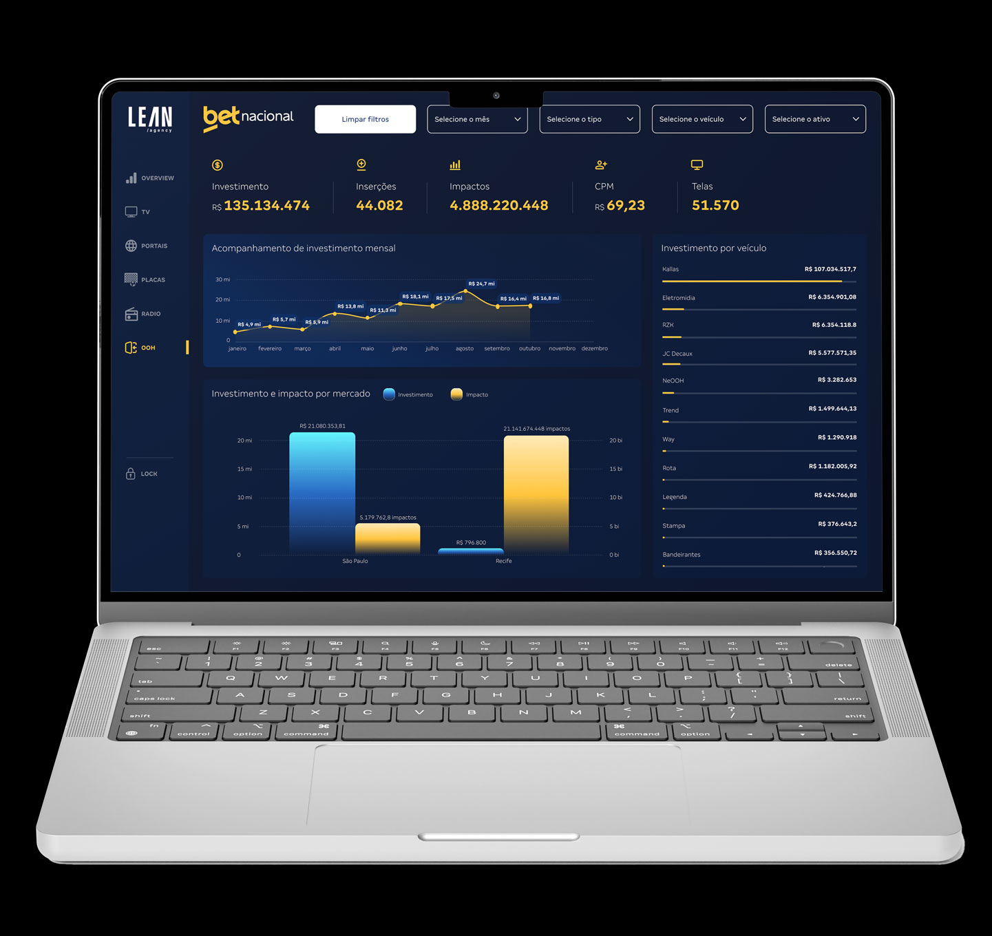
We organized the information into six primary tabs, each dedicated to a media channel, such as Google, Meta, or Affiliates. This provided fast, intuitive access to the data.
Wireframing and Prototyping
We developed low-fidelity wireframes to validate the flow, followed by high-fidelity interactive prototypes in Figma. This enabled continuous feedback from the product team and users.
UX/UI Design
We created a clean, functional, and responsive interface designed to simplify the visual analysis of large data volumes through charts, tables, colors, and a clear hierarchy.
Development
The design was handed off to the development team with complete specifications, interactive prototypes, and organized assets.
Data Visualization
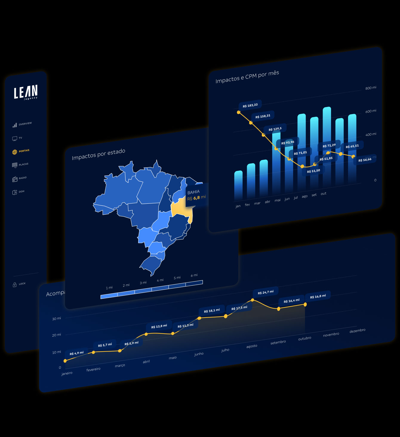
Each dashboard section was carefully designed to communicate the most information with the least noise. We used different visualization formats, including bar and line charts, tables, and comparison cards, prioritizing quick scanning and historical comparisons.
The final product is a robust dashboard with six intuitive, easy-to-use sections, enabling the marketing team to make data-driven decisions in real time.
HANDOFF
Key Deliverables
User research and persona development
Information architecture and sitemap
Wireframes and interactive prototypes (Figma)
Responsive and accessible final interface
Collaboration with the development team
TOOLS
Tools Used
Figma
Google Meet (interviews)
FigJam
Notion